Free color palette generator and WCAG contrast checker — Palettebro
Build palettes, check WCAG contrast, save favorites, and export CSS variables or Tailwind tokens for your web projects.
Step 1
Pick a variant and preset
Start from Material, Tailwind, Static, Dynamic, or Emotional variants, then refine with presets for your project.
Step 2
Make it yours
Use the color picker to change palette colors and the to lock one or more colors to keep them from being changed. Explore all the color tokens in your palette and the accessibility grades. Read the color design guides.
Step 3
Use the palette
Download the palette or use the @palettebro/tailwind plugin in your Tailwind application:
@plugin '@palettebro/tailwind' {
  variant: 'mui';
  primary: #A1B56C;
}
How it works
Choose a palette variant
Palettebro offers four modes of palette generation using different color theory techniques and technologies to create harmonious color combinations:
Intelligent color combinations
Explore palette presets
Each variant includes presets for a mood or style. Pick one to start, then tweak colors in the toolbar.
A variation of complementary colors where one base color is matched with two adjacent colors from its complement, creating bold but balanced schemes with less tension than pure complementary pairs.
Uses four colors arranged into two complementary pairs on the color wheel, offering rich, dynamic possibilities. Ideal for complex designs needing multiple distinct color areas while maintaining harmony.
Three colors equally spaced on the color wheel, providing high contrast while retaining harmony. Offers excellent visual interest and balance, making it suitable for energetic designs that need to remain cohesive.
Progressive shifting of hues across elements, creating subtle color transitions. Great for modern interfaces wanting smooth visual flow and subtle differentiation between elements.
Utilizes varying shades and tones of colors to create dimensional effects and hierarchy. Essential for designs needing clear visual layers and spatial relationships.
Two-color palette using varying intensities and overlays, creating striking visual effects. Popular in editorial design and hero images for bold, memorable impressions.
Raw, high-contrast color combinations with intentionally jarring juxtapositions. Embraces digital-native aesthetics with bold, sometimes uncomfortable color choices for maximum impact.
Subtle, transparent color variations mimicking frosted glass effects. Perfect for modern UI design wanting depth and layering while maintaining lightness.
High-saturation neons contrasted with dark backgrounds, often including electric blues and magentas. Ideal for futuristic, tech-focused designs needing energy and edge.
Pastel purples, pinks, and teals with a retro 80s and 90s influence for nostalgic UI work.
Combines vintage color schemes with modern neon accents, mixing warm nostalgic tones with futuristic highlights. Great for designs bridging past and future aesthetics.
Palette toolbar
Edit colors without leaving the page
After you leave the homepage, a sticky toolbar stays under palette, contrast, and favourites. Generate, tweak seeds, lock colors, and open settings from one place.
Toolbar preview
Primary
Seed color
Secondary
Seed color
Accent
Seed color
On product pages the bar pins to the bottom of the viewport. Open Palette to try it with a live theme.
01
Generate a palette
Hit Generate in the sticky bar to build a full token set from your variant and preset.
02
Open a swatch
Tap primary, secondary, or accent to open the color picker and edit the seed colors.
03
Lock what you like
Lock a color before you generate again so that seed stays put while the rest explores.
Pick colors in the format you already use
The swatch picker switches between numeric spaces and named libraries, so you can start from a Tailwind token, a Pantone® reference, or a RAL code without leaving the toolbar.
Hex, RGB, HSL, LCH
Precise values for design and code handoff
Tailwind
Pick from the Tailwind color scale by name
Pantone®
Match against Pantone®-numbered color references
RAL
Browse RAL industrial color standards
Pantone® is a registered trademark of Pantone LLC. Palettebro is not affiliated with, endorsed by, or sponsored by Pantone.
Why Palettebro?
What you get
Dark mode tokens, P3 colors, WCAG contrast checks, CSS variables, and AI mood schemes.
Every palette ships matching light and dark tokens so both themes stay in sync.
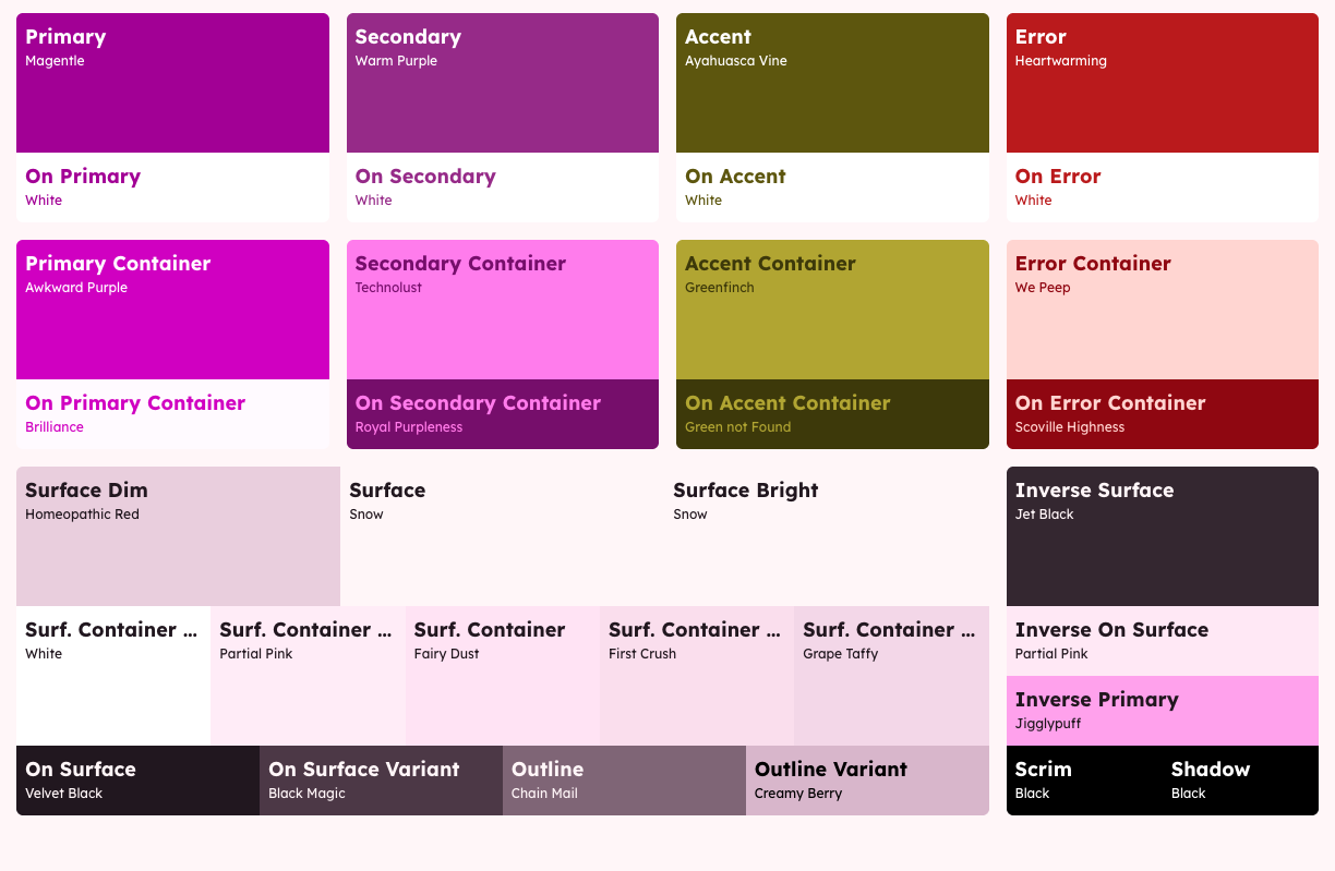
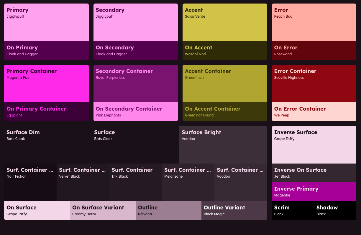
Colors export in Display P3 (and sRGB fallbacks) for wider gamut on supported displays.
See WCAG 2.2 and 3.0 grades for text on each surface before you ship.
Download :root CSS variables, or wire them with @palettebro/tailwind.
:root {
  --color-background: oklch(0.95 0.01 280);
  --color-foreground: oklch(0.05 0.01 280);
  --color-secondary-50: oklch(13.57% 0.05 358.46);
  --color-secondary-100: oklch(20.04% 0.08 359.38);
  --color-secondary-200: oklch(30.15% 0.12 359.69);
  --color-secondary-300: oklch(39.37% 0.15 0.31);
  --color-secondary-400: oklch(48.12% 0.19 359.72);
  --color-secondary-500: oklch(56.94% 0.22 359.87);
  --color-secondary-600: oklch(65.46% 0.24 359.78);
  --color-secondary-700: oklch(74.17% 0.16 359.96);
  --color-secondary-800: oklch(82.94% 0.10 0.21);
  --color-secondary-900: oklch(91.38% 0.04 0.12);
  --color-secondary-950: oklch(95.74% 0.02 0.52);
  --color-accent: oklch(66.30% 0.21 29.94);
  --color-on-accent: oklch(18.31% 0.02 28.53);
  ...
}Generate mood-based Emotional palettes (and AI names) from primary, secondary, and accent seeds.
Open Source
100% Open Source
Palettebro npm packages are open source. View and contribute on GitHub.
Frequently Asked Questions